Daysy Journaling App
An guided journaling app for children with autism to express their emotions.
My Role
UX Research & Design
Team
Austin Lee, Vivian Tu, Misty Chung
timeframe
24-Hours
Tools
Figma
introduction
Creating an impactful product in 24-hours.
Daysy was developed during USC's 24-hour designathon event (CreateSC 2023), with a focus on creating a mobile application that would help autistic children express themselves through journaling. Daysy is designed to be intuitive and engaging, with features that make it easy for children to document their daily experiences and emotions.
HACKATHON PROMPT
Design a mobile app that will help those with communication disorders express themselves through creative digital mediums that can further help them build their sense of community and belonging.
Understanding the problem space
How can we learn more about individuals with communication disorders?
We decided to reach out to our friend Kan, a University of the Pacific student who has grown up with two siblings on the autism spectrum. We conducted semi-structured interviews to learn more about the unique communication and emotional hurdles that individuals with autism commonly experience.


Interviewing
We asked questions about experiences, methods of self expression, different communication styles, problems they face with technology.
Here are some of the types of questions we prepared:
How has having sisters with autism influenced your understanding of the condition and the needs of individuals on the spectrum?
Can you share some personal experiences or stories about your sisters that highlight their unique perspectives, challenges, or strengths?
Have you come across any existing apps or tools that your sisters find helpful or enjoyable? What features do they appreciate?
Interview takaways
What we learned.
"Keep it simple."
Complex text, buttons, and features can pose as a challenge for individuals with autism. Especially when it comes to comprehension and reading, which is why it is important to keep all text in our application easy to read.
"Everyone is different."
He also emphasized that his sisters were at different points on the autism spectrum, and that each had their own distinct set of needs. While some tools may work for one individual, it may not work well for someone else.
Secondary Research
Building off our interview findings.
Emotion Charts aid in identifying emotions effectively.
Kan highlighted that, for one of his sisters emotion charts are commonly used to identify and communicate their own emotions. Emotion charts can be especially helpful in both personal self-awareness and in communicating with others, providing a structured and accessible way for individuals with autism to express their feelings.
Drawing is a valuable form of self-expression.
Drawing is a valuable means of expression for individuals with autism, offering a non-verbal channel to convey emotions and communicate unique thoughts and experiences. While many find comfort in this visual and tactile form of expression, it's crucial to recognize that preferences may vary among individuals on the autism spectrum.
Journaling provides a safe space for communication.
We also found that journaling can provide a safe and structured outlet for self-expression. Many individuals with autism may have difficulty communicating their thoughts and emotions verbally. Writing in a journal or creating drawings allows them to express themselves without the pressure of face-to-face interaction.
Revised design question
How might we design an app that allows children with autism to express and understand emotions in a creative way?
Potential Solution
A daily journaling app designed for children with autism.
After brainstorming different ideas, we thought the best solution would be an app that aims to improve communication and emotional regulation for individuals with autism by encouraging daily journaling. Our app would also include features such as the emotion chart and drawing for reflection and creative expression.
Competitive Analysis
There are no journaling apps designed for people on the spectrum.
After conducting a competitive analysis, we discovered that many note-taking were inaccessible and were difficult to use. In fact, we found that some of these apps were confusing and overwhelming for users with autism.
User flow
The journey should be simple and engaging.
We wanted to make sure that journaling would be simple enough to use, but also fun and interactive. So we created a user flow to visualize the necessary pages and the user's journey through the app. This enabled us to map out a clear plan for the website's architecture and functionality.
Low fidelity wireframes
How can we incorporate physical aspects of journaling into the interface of our app?
We wanted to incorporate the physical aspects from journaling to enhance the overall experience. This included a visualization of emotions overtime which is common in bullet journaling. We created low-fidelity wireframes to outline the layout of each page, and we then discussed the best way to display the necessary information. This helped us to refine the design and determine the most effective way to convey content to users.
Branding
Cultivating a calm and enjoyable experience.
We named our app Daysy, as a play on the character we created and the daily journaling theme. Our goal was to cultivate a calm yet engaging feel within the app, steering clear of overwhelming our users while maintaining an element of fun and interest. This led us to select an indigo color scheme and a playful typeface, setting the tone for a calming and enjoyable user experience.


Iterations
We worked with Kan to make necessary changes.
Adding Voice Memos
One iteration we made was the addition of voice memos rationale. We recognized that for many individuals with autism, typing and writing can be challenging and may hinder their ability to journal effectively. By including the option for voice memos, individuals can easily record their thoughts and feelings without struggling with the physical act of typing.
Removing the Use of Contractions
Another design iteration we implemented was the removal of contractions. We took into consideration that some individuals with autism may have difficulty comprehending contractions, which can cause confusion and hinder their ability to effectively communicate their emotions. By eliminating contractions, we aimed to simplify the language and make the app more accessible and understandable for individuals with autism.
Final Proposed Solution
Introducting Daysy!
Home, Calendar, Account
The home page contains a feed of past journal entries as well as a prompt to start a new one for the current day. By selecting calendar on the nav bar, the user can see their "life in colors", which is a visualization that represents their moods over a month or year. And by selecting account, users can edit their settings and see a mood statistic.
Emotion Charts
Users have the option to choose both their overall mood and specific emotions they are experiencing, providing a personalized way to capture their daily emotional state.
Journal Entries
Users have the flexibility to input text or utilize voice recordings to articulate their emotions, offering a diverse range of options to express their mood.
Drawing Prompts
We integrated a drawing feature, allowing users to artistically convey their emotions from the day, providing a creative outlet for a more expressive and personalized journaling experience.

Encouraging Memos
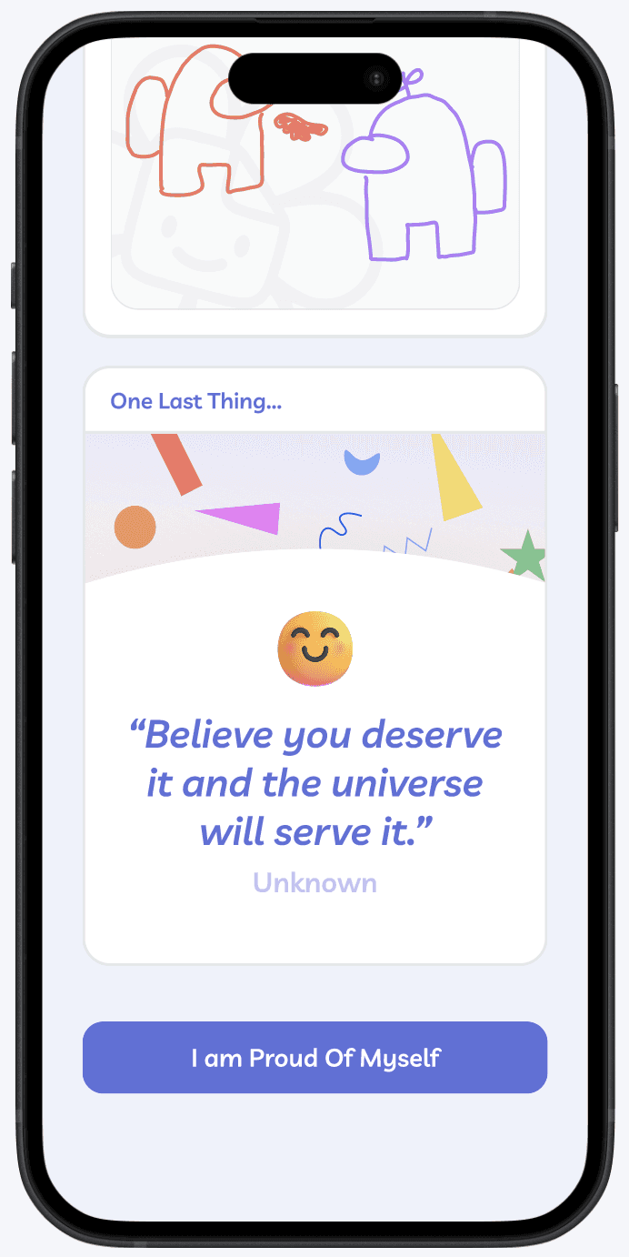
We included encouraging quotes and Call-to-Action buttons to infuse positivity, creating an uplifting atmosphere that encourages users to foster a sense of empowerment in their daily journaling journey.
Shareable Cards
Upon completing a journal entry, users can opt to share personalized cards, enabling them to share their journaling journey with loved ones.
Interactive Protoype
Explore Daysy
Reflection & Learnings
24-Hours Later...
Our team emerged as finalists among 60+ teams nationwide.
I take immense pride in the full high-fidelity design we crafted within the remarkable timeframe of just 24 hours. Our team, along with 8 others, presented in front of an audience during the finale. It was amazing to witness everyone's unique approaches to the challenge.
Balancing innovation and practicality is no easy task.
In this designathon, we learned to manage time effectively, balancing innovation and practicality in the 24-hour timeframe. Our team's key takeaway was leveraging each other's strengths, creating a collaborative environment that kept creativity flowing. This highlighted the importance of a cohesive team dynamic in meeting tight deadlines and optimizing our collective skill set for successful design outcomes.
How we can do even better next time.
With additional time, we'd prioritize an extended user research phase and emphasize testing to dive deeper into user insights. This would allow for a more thorough exploration of alternative design concepts, and feedback ensure that our product would be user friendly and meet our user's needs.rtunity to work with developers and contribute UX and UI enhancements to various developer integration tools within the Sonatype Developer team.


